What's new in 0.12.0
Makersaurus 0.12.0 focuses on the reading and authoring experience: a set of global content components, friendlier navigation, a refreshed H2O look, and a faster, modern build underneath.
This page is itself built on 0.12.0, so most of what follows is live. Click any screenshot to zoom it, switch the code tabs, and find the related links at the bottom.
A refreshed look and a faster build
The default theme now matches the H2O brand kit—the #FFDD00 accent, DM Sans and Inter for text, and DM Mono for code—and every site moves to Docusaurus 3.10, React 19, and Docusaurus Faster (Rspack + SWC) for roughly 4× faster builds.
Click any image to zoom
Every image in your docs is now click-to-zoom by default. Readers click a screenshot to open it in a lightbox, then click again or press Escape to close it—the overlay follows the active color mode, and it needs no configuration. Try it on any image on this page.
Tune it or turn it off with the imageZoom option: set imageZoom: false to turn it off, or pass an object to change the overlay colors or which images zoom. Images that link somewhere keep navigating instead of zooming. See Image zoom.
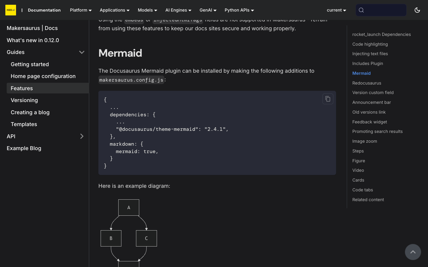
Captioned figures with <Figure>
The <Figure> component pairs an image with a semantic caption, rendered as a real <figure> / <figcaption> and styled the same way across every docs site. caption, alt, width, and align are optional props, content images carry subtly rounded corners to match the H2O UI, and figures are click-to-zoom like any other image. Every screenshot on this page is a <Figure>.

Write it in any page—no import needed. src is the only required prop:
<Figure src="/img/dashboard.png" caption="The MLOps dashboard." width="480px" align="center" />
caption, alt, width, and align (center by default, or left/right) are optional. See Figure.
Numbered procedures with <Steps>
The <Steps> component turns a sequence into a clean numbered walkthrough. The component numbers them automatically, so you can reorder or insert steps without renumbering. Here is the live component—upgrading an existing site to 0.12.0:
- Bump the version
Set
@h2oai/makersaurusto^0.12.0in yourdocumentation/package.json. - Reinstall dependencies
Run
npm installinside thedocumentation/directory. - Build
Run
npm run build. Makersaurus normalizes outdated@docusaurus/*plugin pins to the core version automatically, so the upgrade stays drop-in.
Each <Step> takes an optional title, and both <Steps> and <Step> work in any page with no import. See Steps.
Embedded video with <Video>
The <Video> component embeds a responsive video—a local file, or a YouTube or Vimeo URL—in a 16:9 frame that scales to the column width and follows the active color mode. It works in any MDX file without an import. Watch it below:
No import needed. Pass a URL or a local file as src; title, controls, playing, and aspectRatio are optional:
<Video src="https://www.youtube.com/watch?v=lv-_blntJd4" title="H2O AI Cloud demo" />
See Video.
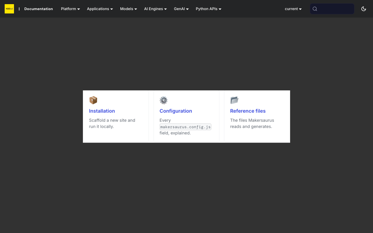
Cards and grids with <Card> / <CardGrid>
Use <CardGrid> with <Card> children to build a responsive grid of linkable cards—handy for landing pages and section indexes. Each card takes a title, an optional icon (an emoji or any node, with no extra dependency), an optional href that makes the whole card clickable, and a description.
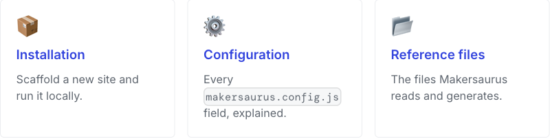
No import needed. href makes the whole card a link; set columns on the grid to change the desktop column count (three by default):
<CardGrid columns={2}>
  <Card title="Get started" icon="🚀" href="/guides/installation">
    Install Makersaurus and scaffold your first site.
  </Card>
</CardGrid>
See Cards.
Synced code tabs with <Tabs>
Tabs let you show the same content as alternatives—for example, a code sample in Python and R. Give every tab block the same groupId and the reader's choice syncs across the whole page and sticks across pages. Pick a language below, then scroll back to any other tab set on the page—they follow your choice:
- Python
- R
import h2o
h2o.init()
library(h2o)
h2o.init()
Unlike the other components, <Tabs> and <TabItem> are Docusaurus built-ins, so import them once at the top of the page:
import Tabs from '@theme/Tabs';
import TabItem from '@theme/TabItem';
Give every related set the same groupId (language is the house convention), and use the same values across sets so a reader's choice lands on the matching tab. See Code tabs.
Math equations
Turn on math rendering and write inline expressions like with single dollar signs, or display equations with double dollars:
It's KaTeX-powered and opt-in: set math: true under markdown in makersaurus.config.js, and remove it to turn math back off. Makersaurus installs the math packages and bundles the style sheet for you, so it works offline with no CDN. See Math for the details.
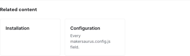
Related content at the bottom of a page
Add a related: list to a page's frontmatter and Makersaurus renders a set of linked cards below the content—a tidy way to point readers to logical next steps. Each entry is a page path or a { title, href, description } object, and the cards reuse <Card>, so they are responsive and dark-mode aware. This page sets related, so the cards appear just below.
Add it to the page's frontmatter—each entry is a page path, or a { title, href, description } object:
related:
  - /guides/installation
  - title: Configuration
    href: /api/config
    description: Every makersaurus.config.js field.
See Related content.
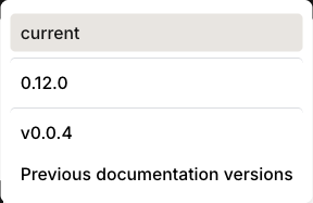
Cleaner version dropdown
On a site with many documentation versions, the version dropdown can grow into a long, flat list. Set groupVersionDropdownByMinor: true in makersaurus.config.js and Makersaurus adds a divider line wherever the major.minor changes between two versions, so patches within the same minor stay grouped together:
v1.7.3-10
v1.7.0
──────────
v1.6.60
v1.6.18
──────────
v1.5.26
It's opt-in and applies to the desktop dropdown, and the divider color follows the theme in light and dark mode.
See Version dropdown grouping.
Dark-mode fixes
Dark mode is more polished across the board: mermaid diagrams now use a readable dark theme instead of the washed-out default, search-result highlighting is legible (WCAG AA), and the cross-product navigation dropdowns now appear in the mobile menu.
Also in this release
Beyond the visible changes, 0.12.0 makes upgrades and releases safer:
- Drop-in upgrades. Makersaurus normalizes outdated
@docusaurus/*plugin pins to the core version automatically, so upgrading from 0.11.x rarely needs config changes. Builds now require Node 20+. - Honest build exit codes.
makersaurus build/startnow exit non-zero when the underlying Docusaurus build fails, so a broken build can no longer pass CI. - A
betarelease channel for prerelease testing, per-PR preview builds of the demo site, and Dependabot for grouped weekly dependency updates. - Branded chrome and a breadcrumbs toggle. Doc breadcrumbs and the active "On this page" entry now carry H2O styling, and you can turn breadcrumbs off with
breadcrumbs: false(see Breadcrumbs).
For the full list of changes, see the changelog.
- Submit and view feedback for this page
- Send feedback about Makersaurus Docs to cloud-feedback@h2o.ai